Live · personal research
databro — reading heartbreak as a season
16 years of US search data, turned into a distress index that knows what it can't prove.
Can you see a breakup coming in the aggregate? Not anyone’s in particular — heartbreak as a season, the way flu has a season. It’s a question I couldn’t shake, so I pointed sixteen years of US search behavior at it and built the whole pipeline to find out. Then I spent most of the effort trying to prove my own answer wrong.
This one was never for a client. It’s the project I built because I couldn’t stop wondering — and the honest answer turned out more interesting than the hyped one. It’s live. Open it, move the month slider, watch the gauge and the forecast respond — then come back and I’ll tell you what to distrust about it.
The question
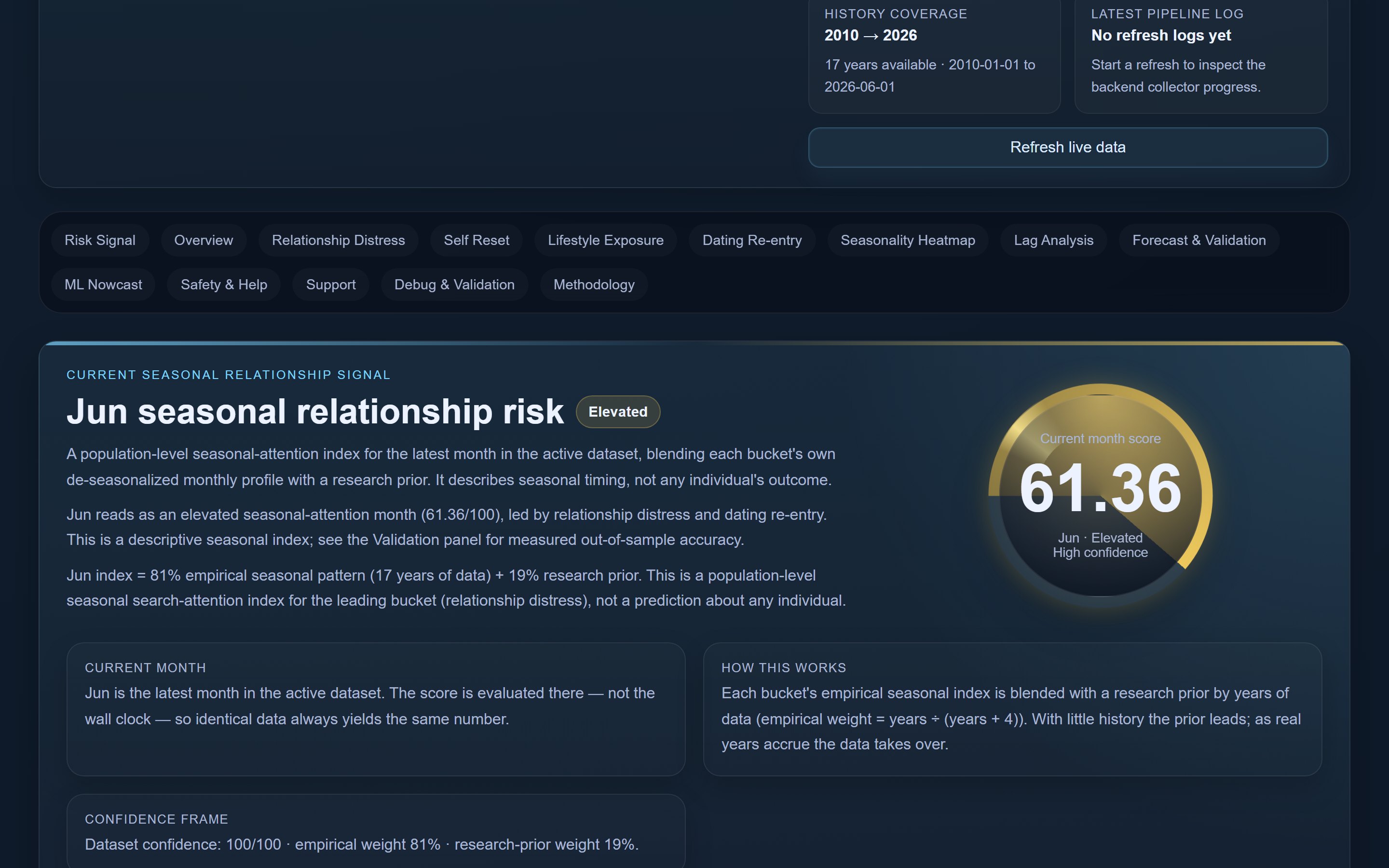
When a relationship is quietly falling apart, people don’t always tell their friends. But a lot of them tell a search box at 2am. “Why won’t he text back.” “How to know if it’s over.” “Divorce lawyer near me.” If you aggregate enough of those private little queries across a whole country and a decade and a half, does a shape emerge? Is there a time of year when attention to heartbreak spikes — when the collective heart goes looking for answers?
That’s the curiosity. The discipline is everything that comes after it, because “a shape emerged” is exactly the kind of thing that feels true and usually isn’t. Anyone can draw a suggestive line through noisy data. The real work was building the machinery to tell a genuine seasonal signal apart from a coincidence — and being honest when the machinery says not significant.
So I gave myself two rules. Build it end to end myself — data engineering through statistics through ML through cloud deploy, no hand-waving over the hard parts. And treat my own favorite conclusion as the prime suspect.
Problem
Google Trends looks like free data until you actually try to take it at scale. Two problems show up fast.
The first is getting the data at all. The naive library path trips the rate limiter and you get walls of HTTP 429 until you give up. The second is subtler and worse: Trends returns relative interest, rescaled per query, so the numbers don’t mean what you think across different pulls. Stitch them together carelessly and you’ve built a beautiful chart of an artifact.
Then the real problem, the one the whole project hinges on: search interest is not a heartbreak. It’s attention. Conflating the two is the easy, satisfying, wrong move, and most “we predicted X from Google searches” stories quietly make it. I decided up front the app would refuse to.
Build
Getting the data honestly
The collector drives a real Chrome instance: load the Trends page, harvest the session cookies, then call the internal API the way the page itself does. That walks past the 429 wall the library path dies on. Along the way I found and fixed two Windows-only bugs that had silently blocked every live collection run — a pathToFileURL entry-point guard and a call to the long-removed page.waitForTimeout — and finding them was its own small detective story, because the collector failed quietly rather than loudly. To fight the relative-scaling problem I added optional anchor-normalization (a two-item query plus a ratio rescale) and repeat-and-average sampling to settle the noise.
The architecture is deliberately boring: offline batch, then static publish. The laptop runs the pipeline when I want fresh data, rebuilds, and syncs to S3. Nothing is always-on, by choice. It costs zero dollars a month to keep alive, which is the correct amount for a curiosity project.
The dataset that comes out is real US Trends from January 2010 to June 2026 — sixteen years, roughly 45 to 50 curated terms, about 9,900 monthly records, around 198 points per series. Not synthetic. The terms group into four indexed buckets: distress, reset, lifestyle, dating, so the dashboard reads like a life cycle, not a word cloud.
The science chose the terms and the window
The literature did real work here. It didn’t decorate the project — it shaped it. Term selection runs two gates: first an empirical screen (volume, redundancy, seasonality), so a term has to actually carry signal; then a literature gate, so the term has to mean something.
- Rejection neuroscience and social pain (Fisher/Aron/Brown 2010; Eisenberger 2003; Kross 2011) justified treating breakup-related search as a genuine distress signal rather than idle curiosity.
- Seraj 2021 (PNAS) found distress markers rise about three months before a breakup is announced. That’s not a footnote — it’s what set the lag window the cross-correlation analysis searches over, though databro itself never grades against actual breakups.
- Dew and Papp on money conflict as a divorce predictor opened the door to financial-stress terms — but only after a macro-confound gate, because divorce is pro-cyclical. Generic finance terms move with the economy, not heartbreak, so they’re sign-flipped and excluded.
- Choi and Varian 2012 grounded the whole premise that search interest can nowcast real-world behavior.
A statistics engine, by hand
stats.js is hand-rolled, dependency-free, runs client-side in your browser, and is verified bit-for-bit against independent reference implementations. I wrote it by hand partly because I wanted to understand every number the dashboard shows, and partly because hiding inference behind a library import is how you end up shipping a confident chart you can’t defend. Inside it:
- A month-conditional risk score from Hazen plotting-position percentiles, so “how distressed is this month” is asked against the same month across history, not the calendar at large — with a Bayesian shrinkage prior of
years/(years+4)so sparse month cells don’t read overconfidently. - Classical seasonal decomposition to separate the calendar from the trend.
- De-seasonalized cross-correlation across lags 0 to 12, with moving-block bootstrap confidence intervals, block-permutation p-values, and Benjamini-Hochberg FDR correction. That last piece is the one that does the unglamorous work — it’s what stops me cherry-picking the one lag that looks significant out of a dozen that aren’t.
- A rolling-origin (walk-forward) backtest scored with the Diebold-Mariano test under the Newey-West / HLN small-sample correction, so “beats the baseline” means out-of-sample, not in-sample flattery — plus a reproducible eval month and timezone-correct month bucketing so a point never lands in the wrong month.
The moment the data chose phi
The forecast is a damped-trend Holt-Winters model, and the damping parameter, phi, isn’t a number I picked — it’s grid-selected from the data. The data chose phi = 0.85. It means the forecast mean-reverts instead of extrapolating a trend straight off a bounded 0-to-100 axis; a model with no damping would happily forecast a distress index above the 0-to-100 axis it lives on. This one knows the trend will fade, because the history told it so. A forecast that refuses to extrapolate forever is a feature, not a bug — and watching the grid search land on 0.85 was a nice moment of letting the data, not me, set the parameter.
The model I chose not to build
There’s an offline Python sidecar (ml/nowcast.py) that ships a static ml_predictions.json snapshot: a structural time-series model (statsmodels UnobservedComponents — local-linear-trend plus seasonal) with sparse LassoLarsCV variable selection for driver attribution, validated by the same leakage-free rolling-origin Diebold-Mariano discipline. It earns about 0.49 out-of-sample skill against seasonal-naive at DM p ≈ 0.014 over 125 origins — which is real, and which is only about +8% over plain persistence (a tougher baseline), stated plainly rather than dressed up. At post-surge turning points it leans on a 50/50 blend of the structural forecast and plain climatology, because that’s where single models get cocky and wrong.
The most important decision here was a no. With ~198 monthly points and predictors that move together anyway, the Makridakis M3/M4 evidence is blunt: statistical methods win at this scale. Reaching for a neural net would have been the resume-flattering move and the worse one. Knowing what not to build is part of the work.
Numbers
The headline readings, all reproduced to the digit under audit. The current month-conditional risk index sits at 61.36. The backtest earns a mean out-of-sample skill of 0.327 against a seasonal-naive baseline. The strongest single result is the distress series one month ahead — forecast skill 0.455 at Diebold-Mariano p = 0.0055.
Here’s the part I’m proudest of, and it’s the part that makes the result smaller: after Benjamini-Hochberg FDR correction, only the three t+1 horizons survive — distress, reset, lifestyle — and the dashboard says exactly that, out loud, on the badge. The longer horizons don’t survive, and the app doesn’t let a marginal long-horizon result wear a green checkmark it didn’t earn.
Before I called any of it done, I ran the whole thing through adversarial review: an 11-agent numbers-and-methodology audit, plus a separate 5-dimension, 32-finding code audit. Every headline number reproduced. Zero high or critical defects. Every fix was honesty calibration — FDR-correcting the significance badges, requiring a confidence interval to exclude zero before any “leads” claim, de-leading the lag-0 copy, killing stale snapshots — not broken math being patched. The corrections all made the app claim less.
What it refuses to claim
This is the section that makes the rest defensible, so it lives in plain sight, not in a footnote.
- It measures search attention, not clinical or relationship outcomes. There’s no monthly administrative ground truth for non-married breakups, so most of this has nothing real to grade against.
- The bucket weights are hand-tuned, not learned.
- The 12-point climatology rank is quantized and gets fragile on flat signals.
- The backtest forecasts the index against itself out-of-sample, not against real divorces.
And the citation I’m most glad I found argues against me: Kuran & Kuran 2026, “Digital Behavioral Decoupling.” Run honestly against actual US divorce rates, Trends gives roughly 0% gain. The app cites that paper prominently, against its own thesis, and concludes — in its own copy — that this is a search-attention instrument, not a validated divorce predictor. The Safety & Help panel is intentionally non-predictive, too: abuse and IPV terms are kept entirely out of the index and surface instead as a resource layer with crisis hotlines, because a surge in abuse-term searches reflects cultural awareness, not incidence. Some signals shouldn’t be modeled, only respected.
The literature picked the terms. The data picked the lag. The math admits the rest.
Stack
Frontend: Vue 3 (Composition API, script setup), Vite 5, ECharts via vue-echarts — an SPA, ~2.1 MB build. Statistics: hand-rolled, dependency-free stats.js, client-side. ML: Python 3.13 with statsmodels and scikit-learn, offline. Collector (dev only): Express 5 plus a Puppeteer-core real-Chrome automation strategy. Cloud: private AWS S3 + CloudFront (OAC), ACM TLS, Route53 — pure static hosting, zero server compute.
What this proves
You can tell a lot about someone from the project they build when no one asked them to. This one says I’ll chase a genuinely human question for the joy of it, build the full stack to answer it — resilient collection against a hostile rate limiter, statistics implemented by hand so I understand every step, applied ML with the judgment to stay small, a full Vue 3 product, a zero-cost static AWS deploy — and then spend the back half of the effort trying to talk myself out of the answer.
The honest finding is the interesting one: collective attention to heartbreak does have a calendar, and you can forecast it a month out, but that’s attention, not destiny — and the app says so itself. Go open the live dashboard, drag the gauge to a month, run the damped forecast out and watch it refuse to run away, and read the caveats sitting right next to the charts. The forecast knows what it doesn’t know. That was the point.
Stack
Have data? Let’s make it think.
Open to Data & AI technical-lead and leadership roles, and to Vizlogic consulting engagements.